Chapter 5 R plots
5.1 Basic plots in R
Base R has a vast library of functions for plotting data for you to communicate your results to others. Even there are addition packages (i.e. ggplot) to plot complex and big data more efficiently. We will cover a few functions from the base R in this workshop. We will use a built-in data-frame (mtcars) that comes with R installation and we will use different columns to draw various graphs in this chapter.
5.1.1 scatter plot
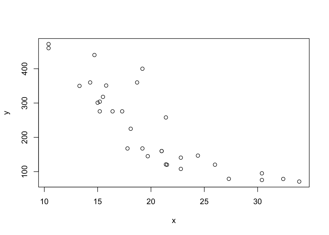
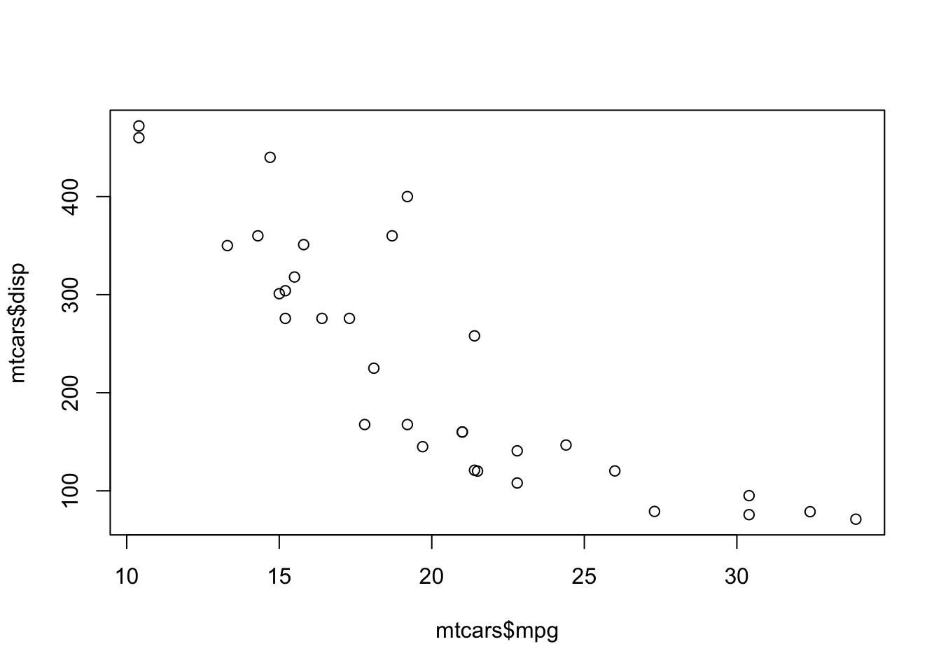
The first one we will learn is the scatter plot. You need two variables to draw such a plot and basically you look at the relationship between these two variables using scatter plot. The function to do it is simple: plot()
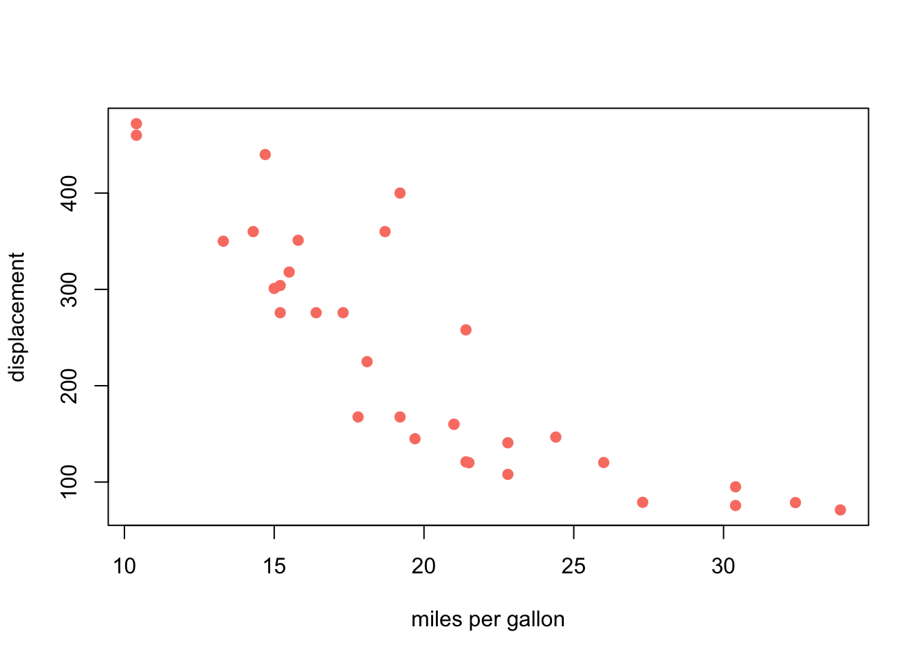
# We can decorate the plot with different annotations -
plot(x,
     y,
     xlab = "miles per gallon",
     ylab = "displacement",
     col="salmon",
     pch=19,
     #lty =2,
     #type = "b"
     )
5.1.2 bar plot
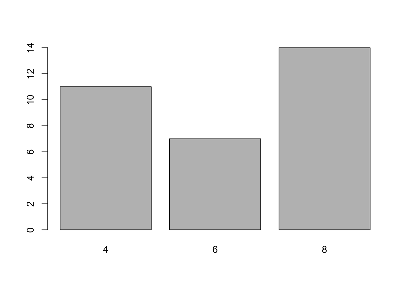
Another type of graph that we will cover today is the bar plot. If we want to know how many cars are there by the types of cylinders in the mtcars data, we use the table() function. Then we use the barplot() function to visualise the counts.
# you can add some annotations as well
barplot(counts,
        xlab = "Number of cylinders in a car",
        ylab = "Frequency",
        main = "The number of cars by different cylinder types")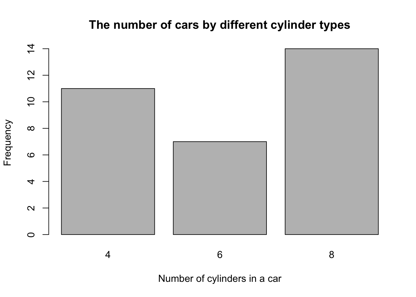
5.1.3 histogram
The next type of graph we will cover is the Histogram. Histogram shows you the distribution of your data points. For example, you want to see the distribution of the displacement -
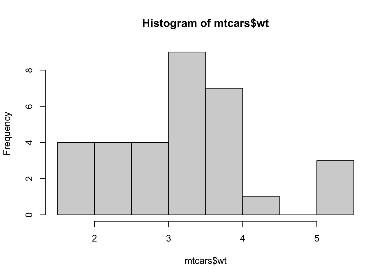
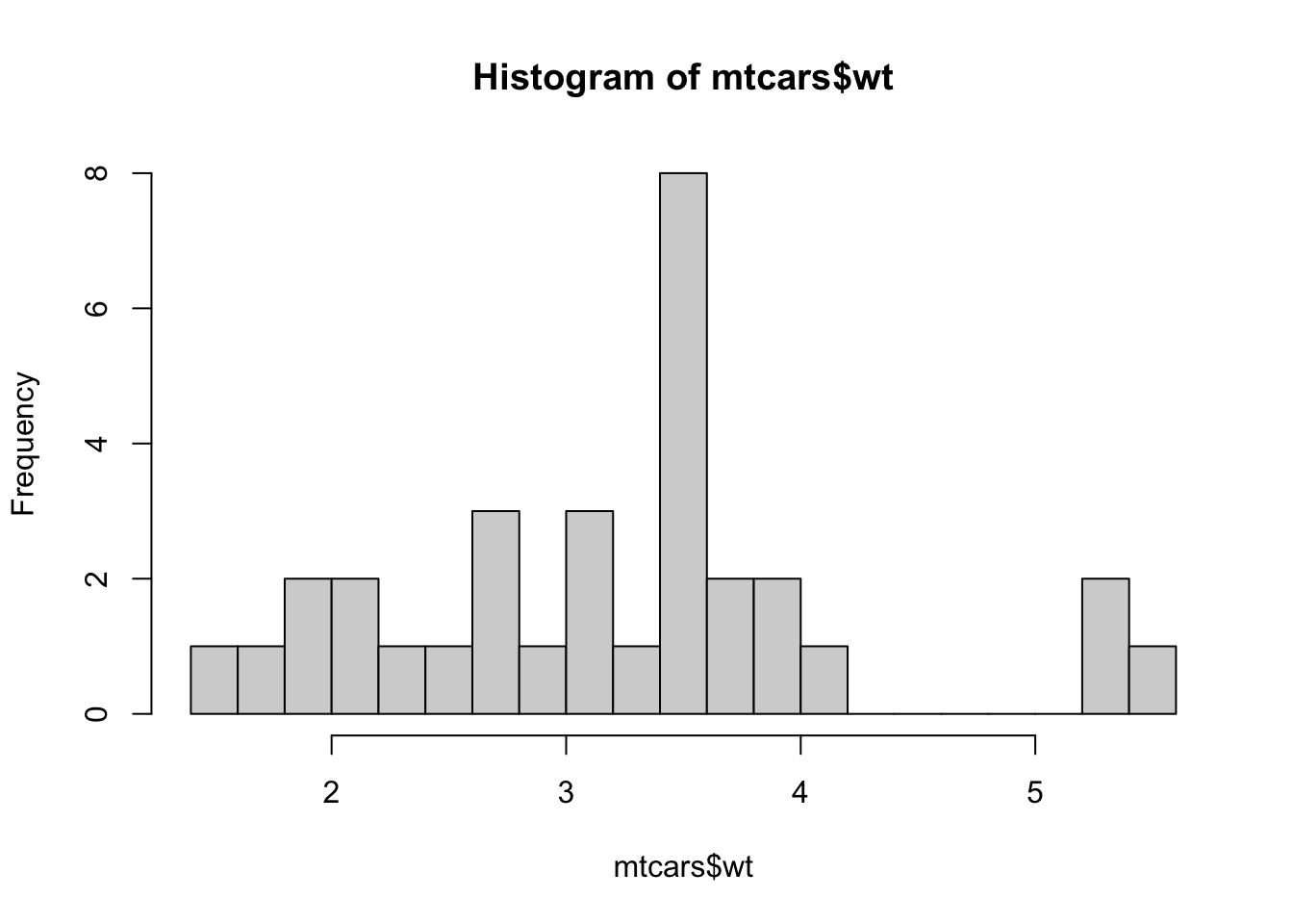
# you can also add some annotations
hist(mtcars$wt, breaks = 10, xlab = "weight (1000 lbs)")
abline(v=mean(mtcars$wt), col="red", lty=2, lwd=2)
abline(v=median(mtcars$wt), col="blue", lty=3, lwd=2)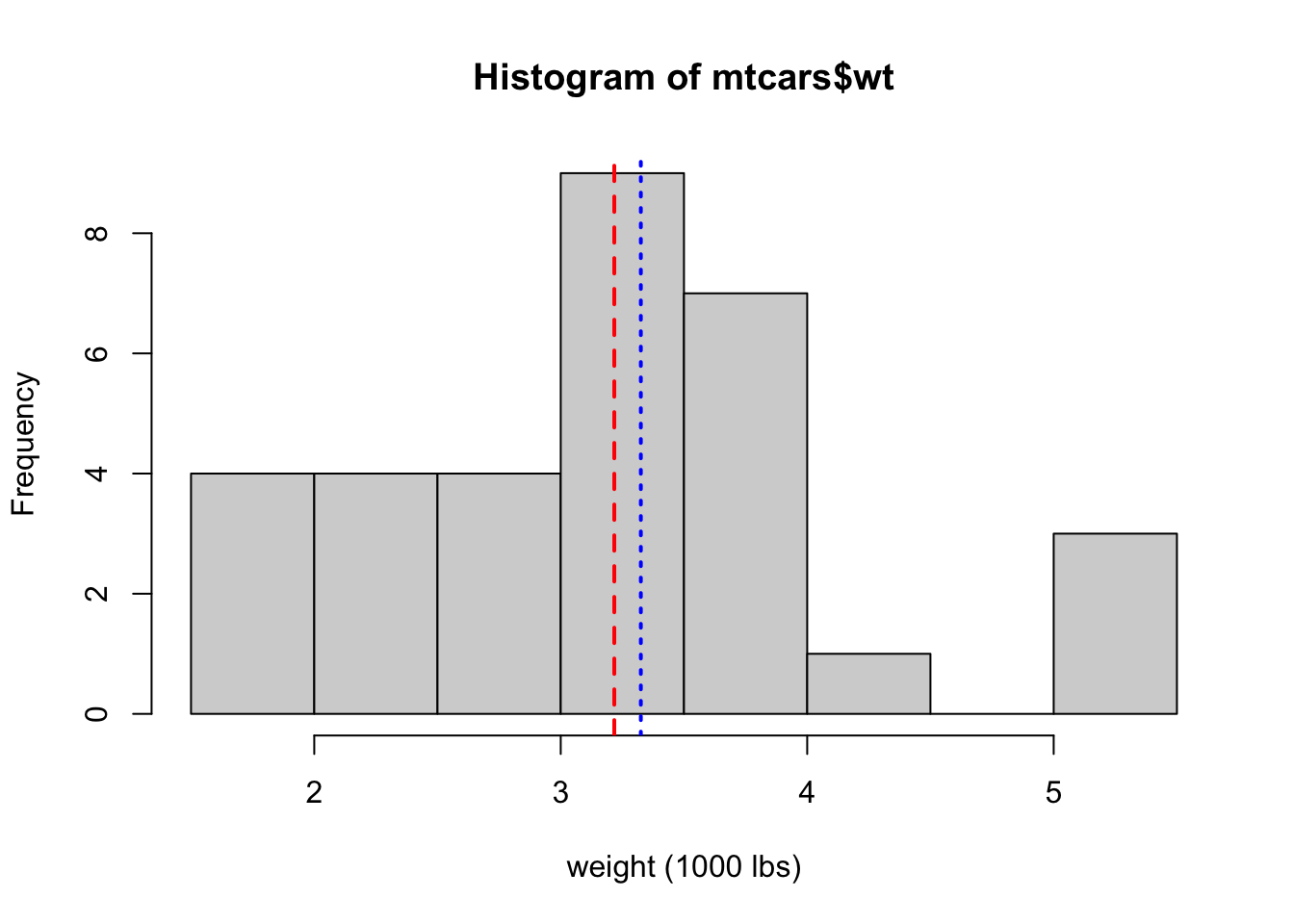
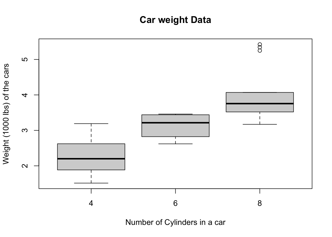
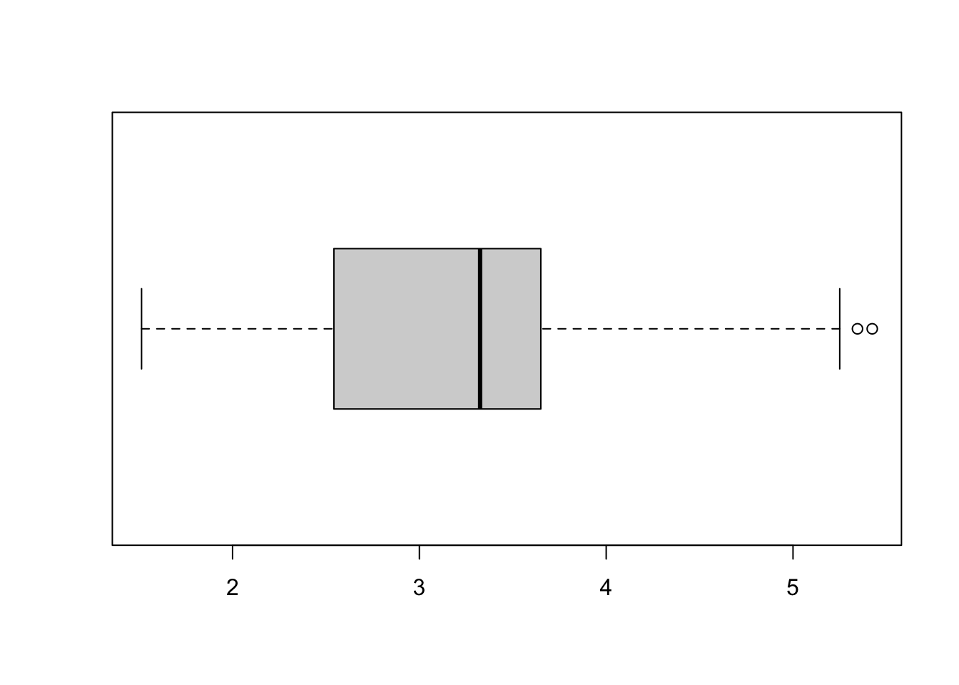
5.1.4 box plot
The last type of plot, that we will cover today, is the box plot. It is important to understand the distribution of your data, and box plot is an alternative, but effecient way.

For example, if you want to see the distribution of weights of the cars using box plot, the command is -
Most importantly, you can look at the data compared to other variables as well. For example, if you and to look at the MPG values by car cylinder types, here is the code -
boxplot(wt~cyl,
        data=mtcars,
        main="Car weight Data",
        xlab="Number of Cylinders in a car",
        ylab="Weight (1000 lbs) of the cars")