Chapter 3 Plotting using ggplot2
3.1 Mini intro to ggplot2
To my opinion, the most elegant package for data visualisation in R is ggplot2. Here, gg stands for the grammar of graphics. Put aside what you have learnt so far on basic R plotting techniques, ggplot2 defines the art of plotting in a whole new way. The learning curve may be steep, but once you learn it, you will fall in love with it (I promise). You provide the data, tell ggplot2 which variables to map to the aesthetics, and tell the plot type you want draw. ggplot2 will take care of the rest.
3.2 Installation
The easiest way to get ggplot2 is to install the whole tidyverse:
install.packages("tidyverse")Alternatively, install just ggplot2:
install.packages("ggplot2")Or the the development version from GitHub:
install.packages("devtools")
devtools::install_github("tidyverse/ggplot2")
And then, load it …
library(ggplot2)3.3 Plotting with ggplot2
3.3.1 Difference between base R plot and ggplot2
In this chapter, I will be using the mtcars dataset for plotting different graphs. For refreshing your memory, let’s have a look at the dataset -
head(mtcars)## mpg cyl disp hp drat wt qsec vs am gear carb
## Mazda RX4 21.0 6 160 110 3.90 2.620 16.46 0 1 4 4
## Mazda RX4 Wag 21.0 6 160 110 3.90 2.875 17.02 0 1 4 4
## Datsun 710 22.8 4 108 93 3.85 2.320 18.61 1 1 4 1
## Hornet 4 Drive 21.4 6 258 110 3.08 3.215 19.44 1 0 3 1
## Hornet Sportabout 18.7 8 360 175 3.15 3.440 17.02 0 0 3 2
## Valiant 18.1 6 225 105 2.76 3.460 20.22 1 0 3 1str(mtcars)## 'data.frame': 32 obs. of 11 variables:
## $ mpg : num 21 21 22.8 21.4 18.7 18.1 14.3 24.4 22.8 19.2 ...
## $ cyl : num 6 6 4 6 8 6 8 4 4 6 ...
## $ disp: num 160 160 108 258 360 ...
## $ hp : num 110 110 93 110 175 105 245 62 95 123 ...
## $ drat: num 3.9 3.9 3.85 3.08 3.15 2.76 3.21 3.69 3.92 3.92 ...
## $ wt : num 2.62 2.88 2.32 3.21 3.44 ...
## $ qsec: num 16.5 17 18.6 19.4 17 ...
## $ vs : num 0 0 1 1 0 1 0 1 1 1 ...
## $ am : num 1 1 1 0 0 0 0 0 0 0 ...
## $ gear: num 4 4 4 3 3 3 3 4 4 4 ...
## $ carb: num 4 4 1 1 2 1 4 2 2 4 ...Now, I will draw scatter plot, first using the base R plot() function, and then using ggplot2.
plot(x=mtcars$mpg, y=mtcars$wt)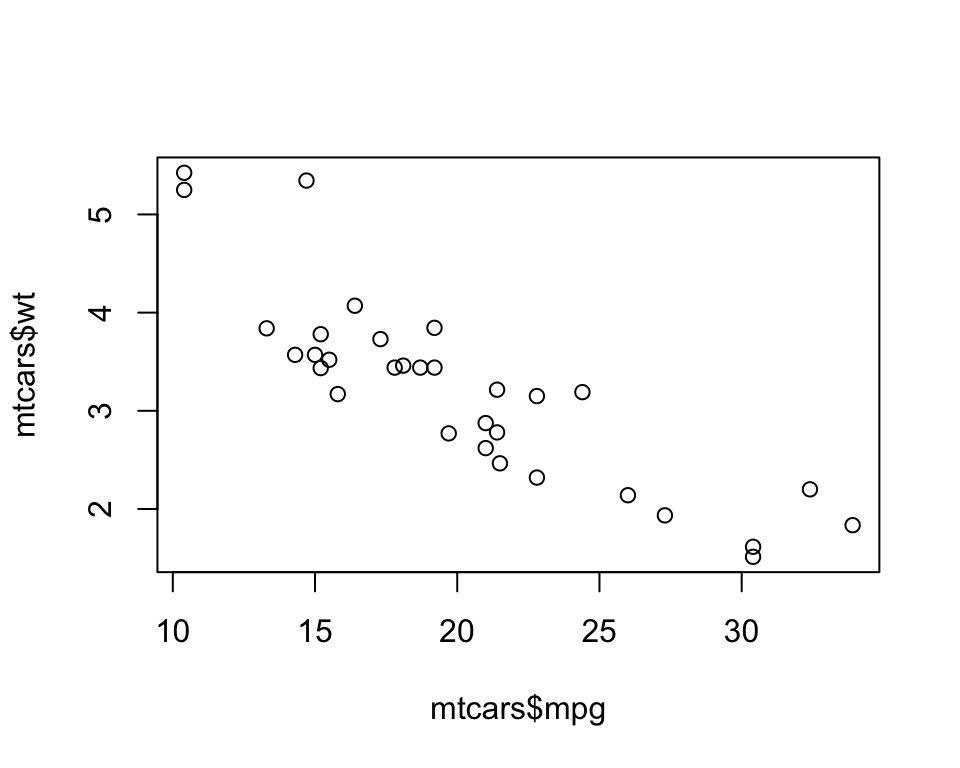
ggplot(data = mtcars, mapping = aes(x=mpg,y=wt)) +
geom_point()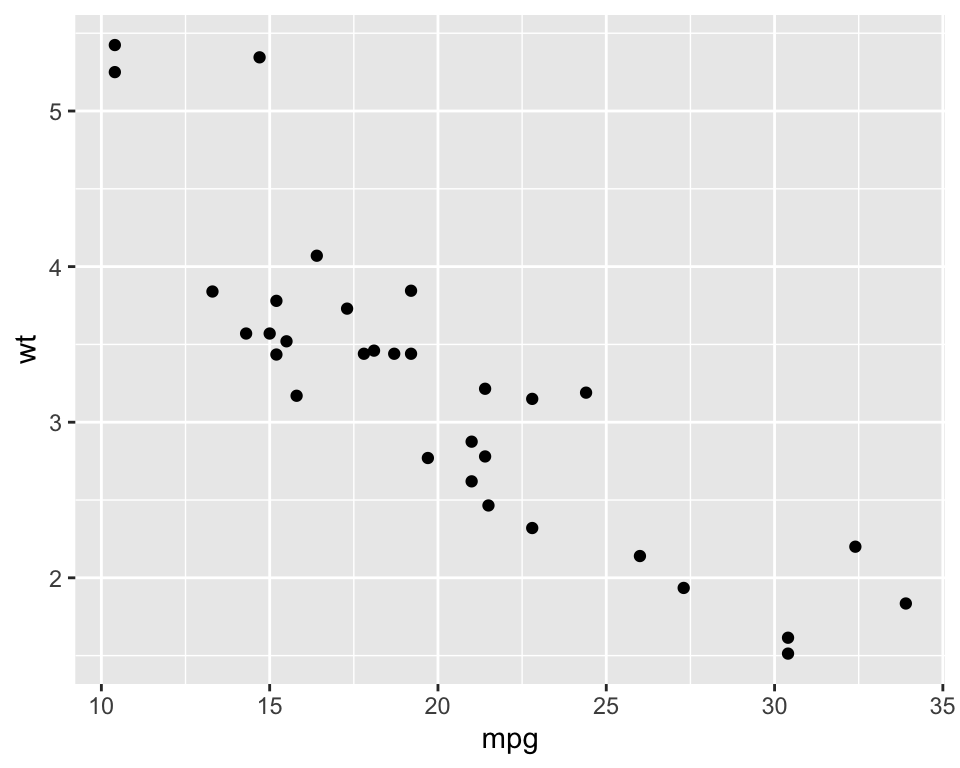 You can see the stark difference between them.
3.3.2 General parameters for ggplot()
For plotting with ggplot2, you start with ggplot() function and you privide the data. You then put the parameters you need to plot, like - the aesthetic mapping using mapping = aes(). Then, you add on layers (like geom_point()), scale (like scale_x_continuous()), faceting specifications (like facet_wrap()), coordinate systems (like coord_flip())
In short, these are the elements that you might see in a block of graph using ggplot() function -
data
aesthetic mapping
geometric objects
statistical transformations
scales
coordinate systems
position adjustments
faceting
You can specify different layers of the plot and combine using “+” operator. Now I will dive into different aspects of the ggplot() function -
3.3.2.1 Aesthetic mapping using aes()
Here aesthetic means something that you can see. It is mainly the mapping between a visual attribute and a variable. These are some important aesthetics -
position (x,y)
colour (basically the colour of the outer rim of the object)
fill (the filling-colour/inside-colour of the object)
shape (mainly of point)
line type
size etc
You can read all about them on your RStudio help panel by typing -
help.search("geom_", package = "ggplot2")3.3.2.2 Geomatric Objects `geom_
There are so many geom objects in ggplot2, like -
geom_point()geom_lines()geom_boxplot()
Again, you can find those geom objects by typing in -
help.search("geom_", package = "ggplot2")Now time to check what I have just mentioned, but before that (as usual) let’s check the data that we are going to use. I will switch to another dataset, called mpg, from R.
?mpg3.3.2.2.1 scatter plot with geom_point()
I will now draw a scatter plot using highway miles per gallon as a function of engine displacement (in litres) -
ggplot(data=mpg, aes(x=displ, y=hwy)) +
  geom_point()
Interestingly, you can save the whole or part of the code snippet in a variable -
# can be saved in a vector first, then print it. Like -
p1 <- ggplot(data=mpg, aes(x=displ, y=hwy)) + geom_point()
# now invoke it
p1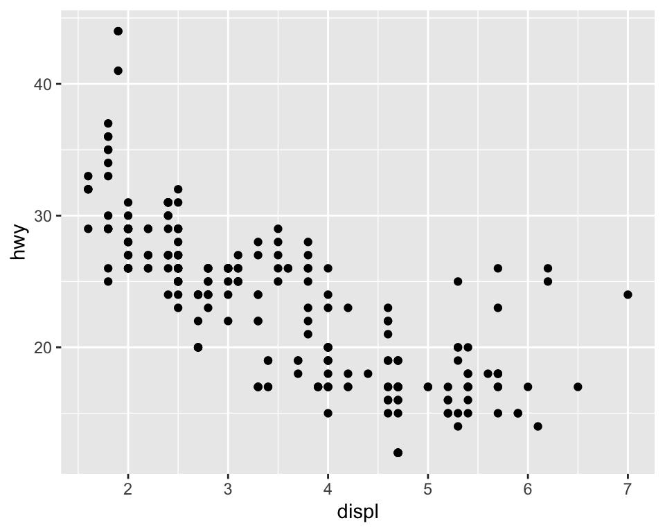
# or
p <- ggplot(data=mpg, aes(x=displ, y=hwy)) # saved as a base plot variable. I will call p and add different layer on it.
p2 <- p + geom_point()
p3 <- p + geom_line()
p4 <- p + geom_smooth()
p5 <- p2 + geom_smooth(se = F, linetype="dashed")
p5
## `geom_smooth()` using method = 'loess' and formula = 'y ~ x'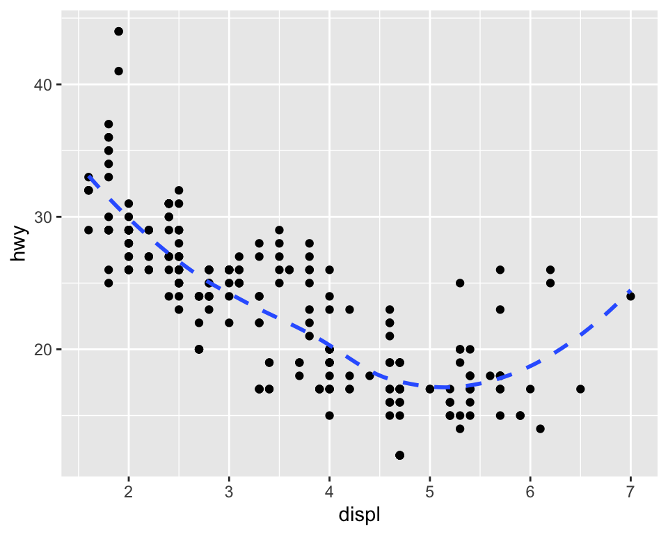
Now let’s play with colour and size -
p + geom_point(colour="red", alpha = 0.2, size = 3) # outside aes(), affects the same for all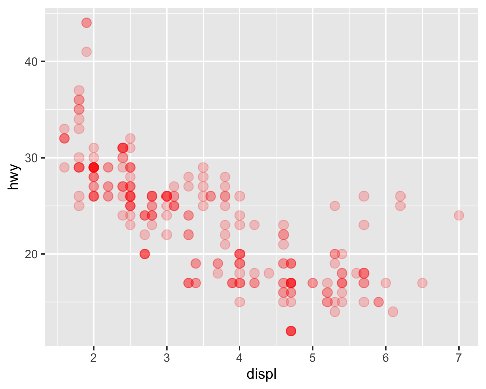
p + geom_point(aes(colour=year, shape=factor(cyl)), size = 3) # inside aes(), affects accordingly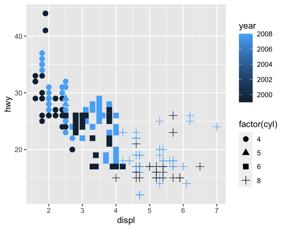
If you want to play with different shades of colours in your plots, This is a good place to start. The default colour scheme is not colour-blind friendly. You can even find a colour-blind-friendly colour palette following this link.
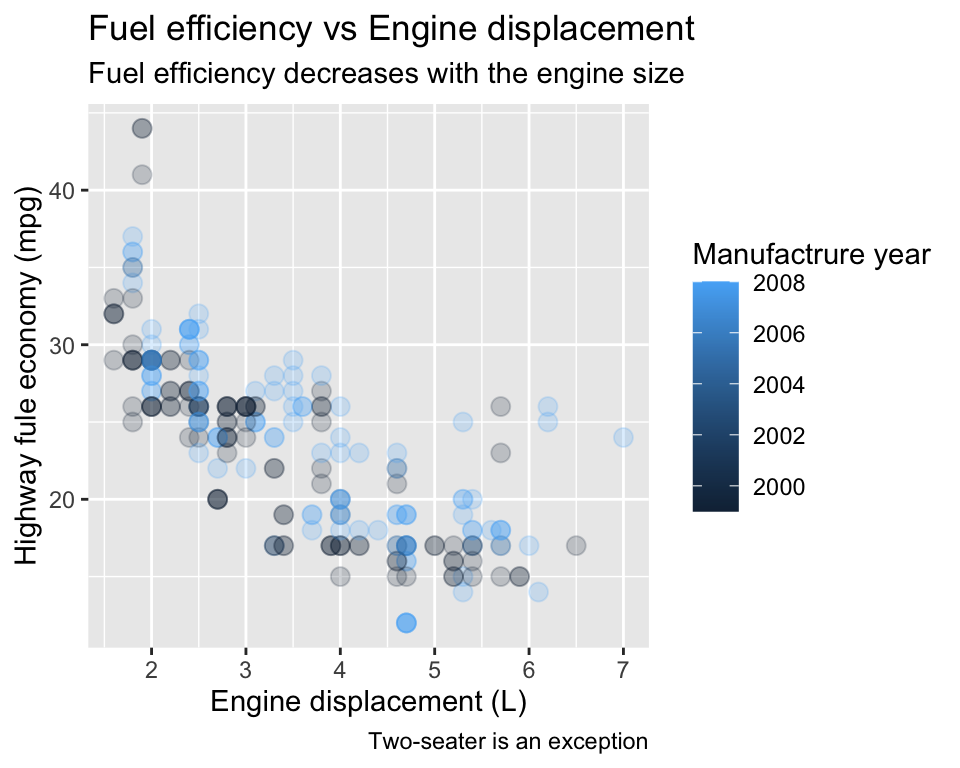
You can play with title and axis labels -
p +
  geom_point(aes(colour=year), size = 3, alpha = 0.2) +
  #geom_text(aes(label=model)) + # may be not a good idea now.
  labs(
    title = "Fuel efficiency vs Engine displacement",
    subtitle = "Fuel efficiency decreases with the engine size",
    caption = "Two-seater is an exception",
    x = "Engine displacement (L)",
    y = "Highway fule economy (mpg)",
    colour = "Manufactrure year"
  )
If your datapoints are a bit tightly spaced, you can jitter a bit -
p +
  geom_point(aes(colour=class), size = 3, position = "jitter") # introducing jitter here. For controlling the amount of movements, you can use geom_jitter()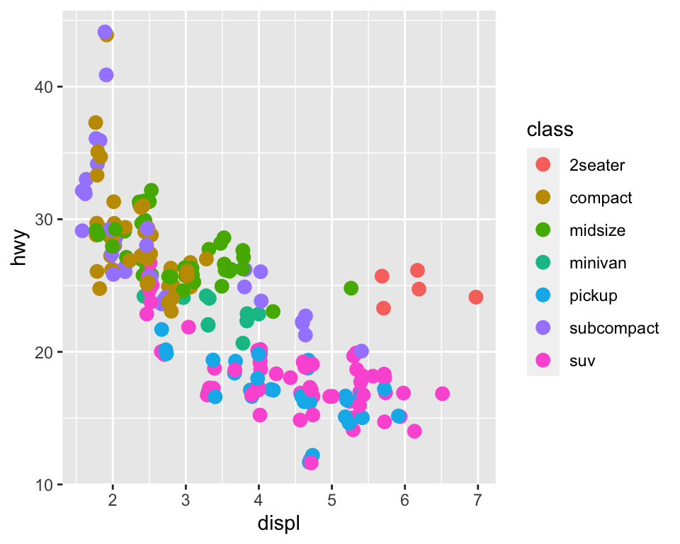
Let’s play with some scaling -
p +
  geom_point(aes(colour=class), size = 3, alpha = 0.2) +
  scale_x_continuous(name = "x-axis label changed", breaks = seq(0,10,by=5),limits = c(0,10)) +
  scale_y_continuous(trans = "reverse")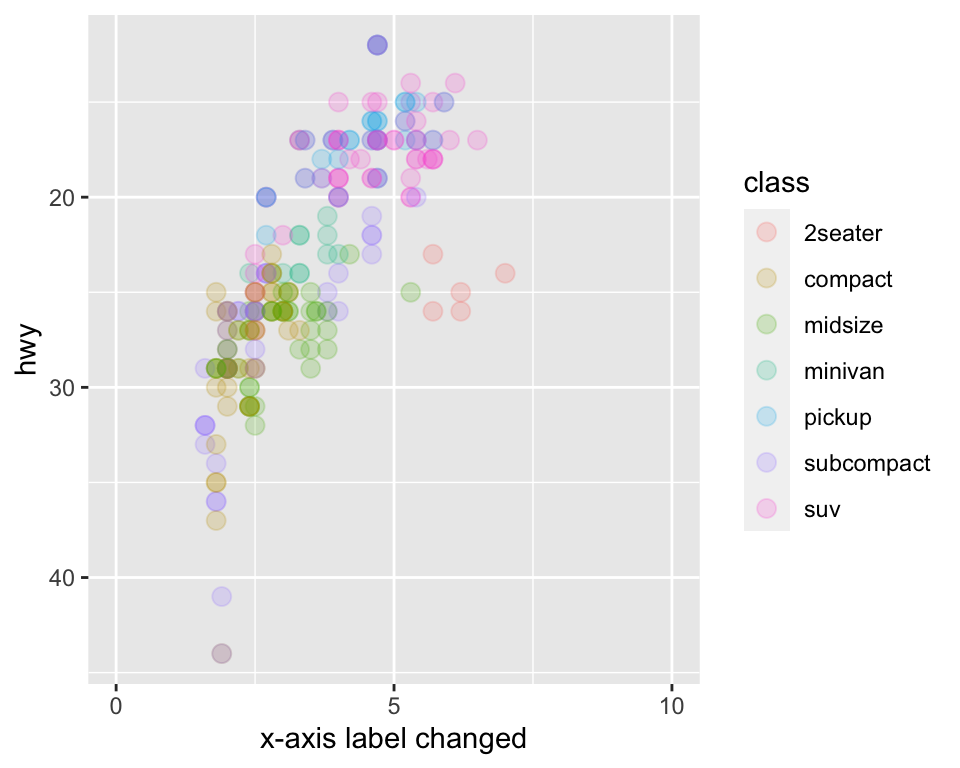
p +
  geom_point(aes(colour=class), size = 3, alpha = 0.2) +
  scale_colour_brewer(palette = "Set1") # scale_colour is a widely used one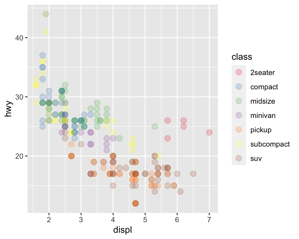
You can play with the positioning of the legend, too -
p +
  geom_point(aes(colour=class), size = 3, alpha = 0.2) +
  theme(legend.position = "left")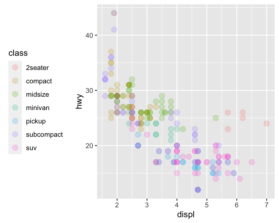
p +
  geom_point(aes(colour=class), size = 3, alpha = 0.2) +
theme(legend.position = "none") 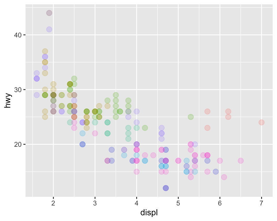
3.3.2.4 Faceting
If you have too many data points, the idea of faceting is to sub-setting the plot by an appropriate variable -
p +
  geom_point(aes(colour=class), size = 3, alpha = 0.2) +
  facet_wrap(~ class, ncol = 2)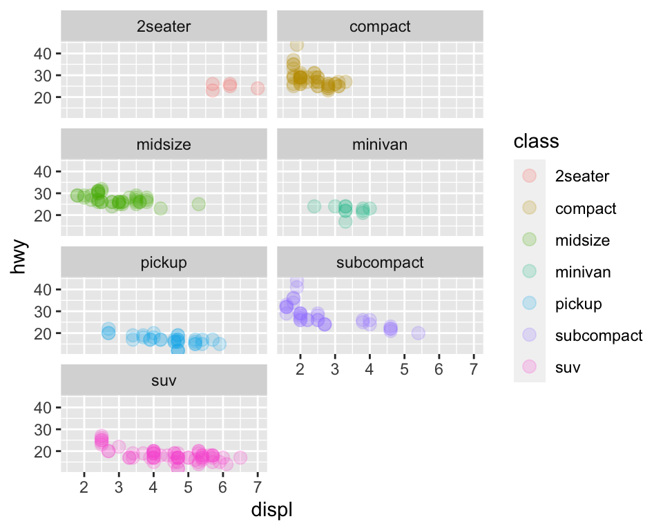
p +
  geom_point(aes(colour=class), size = 3, alpha = 0.2) +
  facet_grid(~ class) # if there were any blank plot, won't be plotted here
3.3.2.5 Theme
There are different themes to play with -
p +
  geom_point(aes(colour=class), size = 3, alpha = 0.2) +
  theme_void()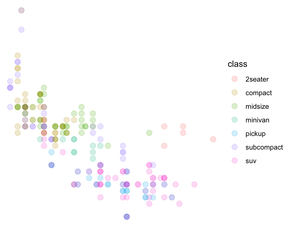
3.3.2.6 Other geometric objects
3.3.2.6.1 Bar plot and position adjustment
By default, the bar plot comes as stacked. If you fill it by a variable that is not used to plot the bars, you can see what I mean. However, for playing with the bar plot, I will be using another dataset called ‘diamonds’ that comes with R.
To begin with -
ggplot(data=diamonds) +
  geom_bar(mapping = aes(x=cut))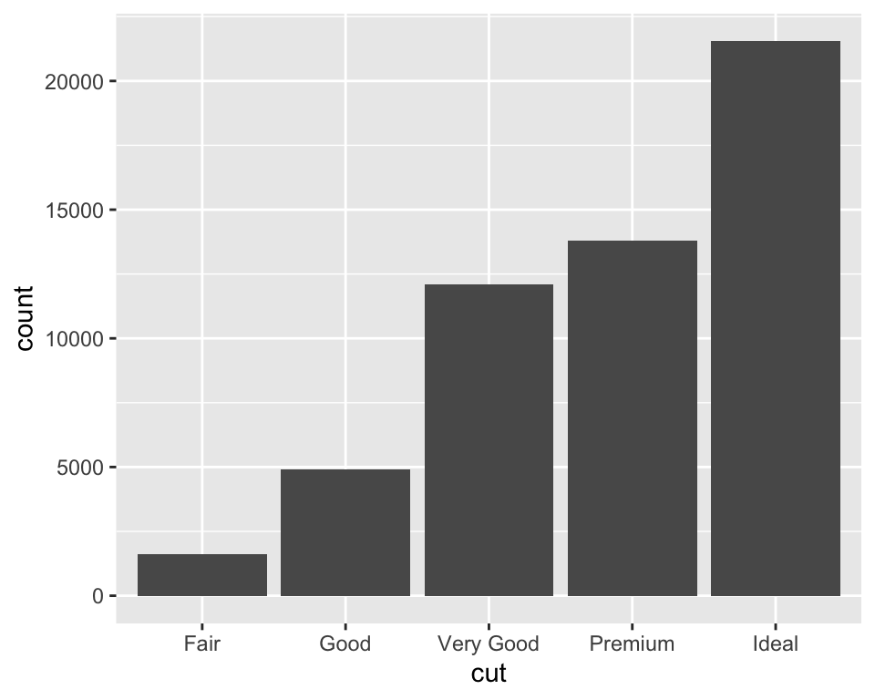
ggplot(data=diamonds) +
  geom_bar(mapping = aes(x=cut, fill=cut))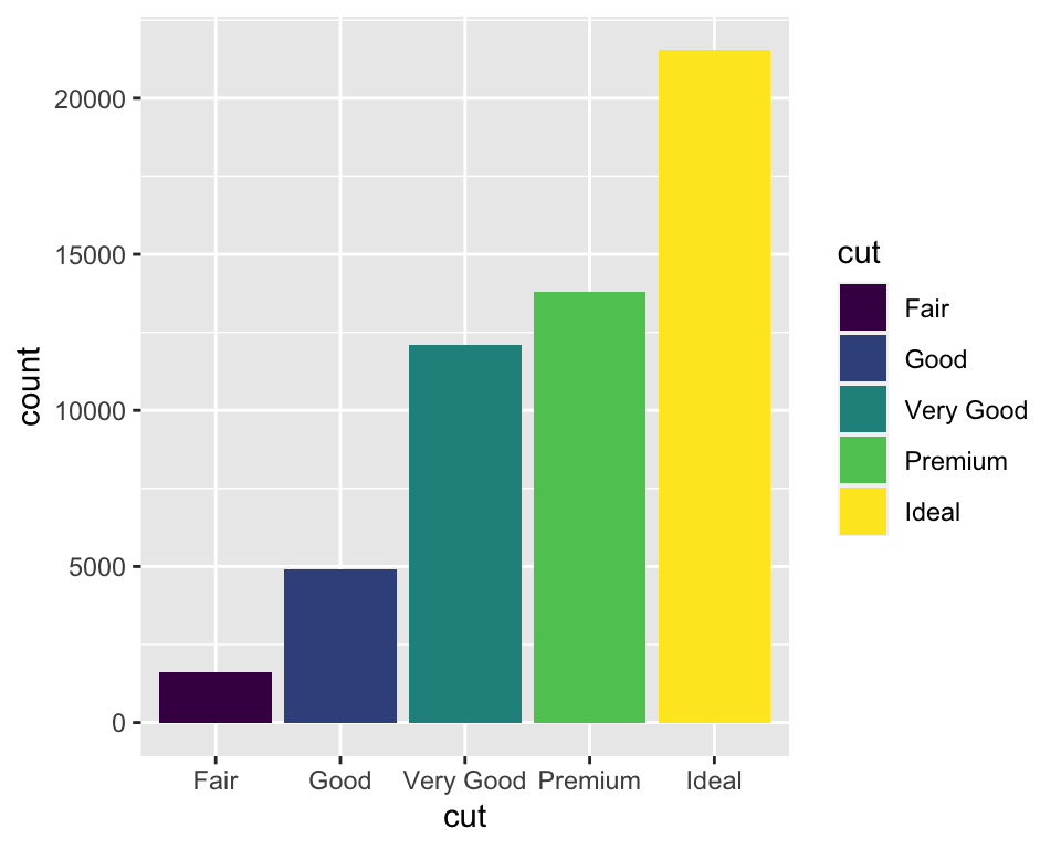
But -
ggplot(data=diamonds) +
  geom_bar(mapping = aes(x=cut, fill=clarity))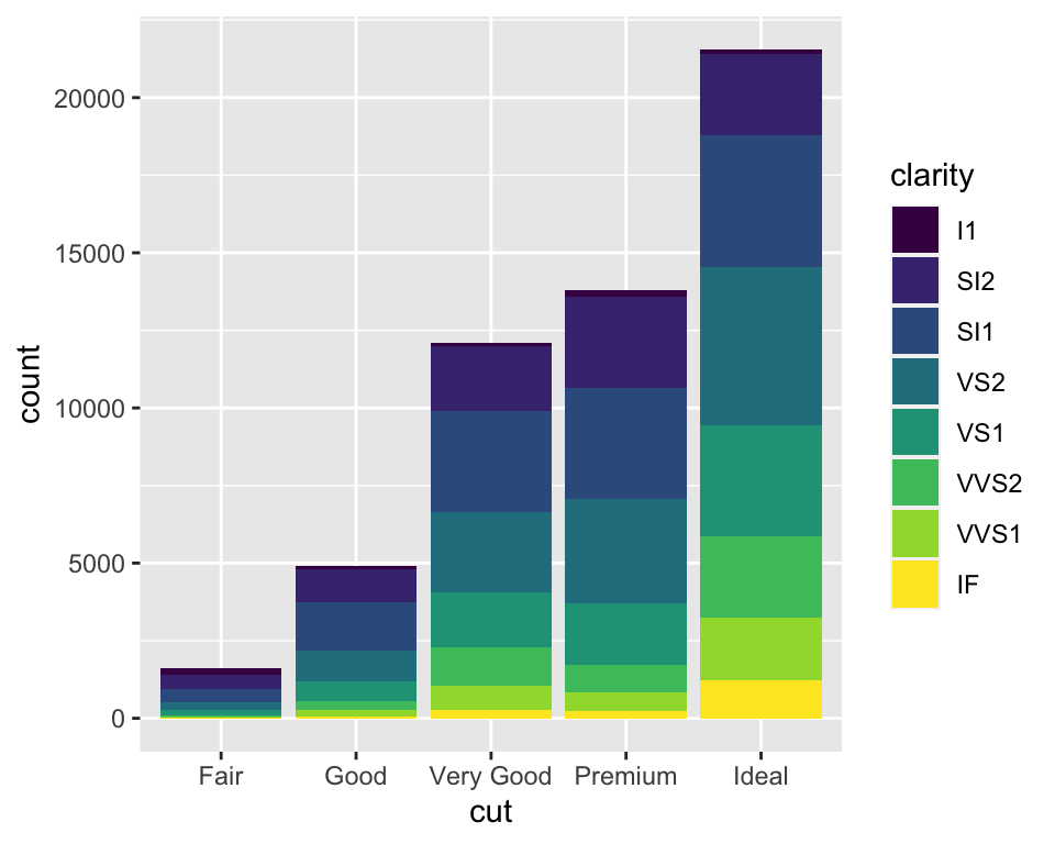
The position is adjusted by the position argument which takes in three options - “identity”, “fill”, and “dodge”
ggplot(data=diamonds) +
  geom_bar(mapping = aes(x=cut, fill=clarity), position = "identity")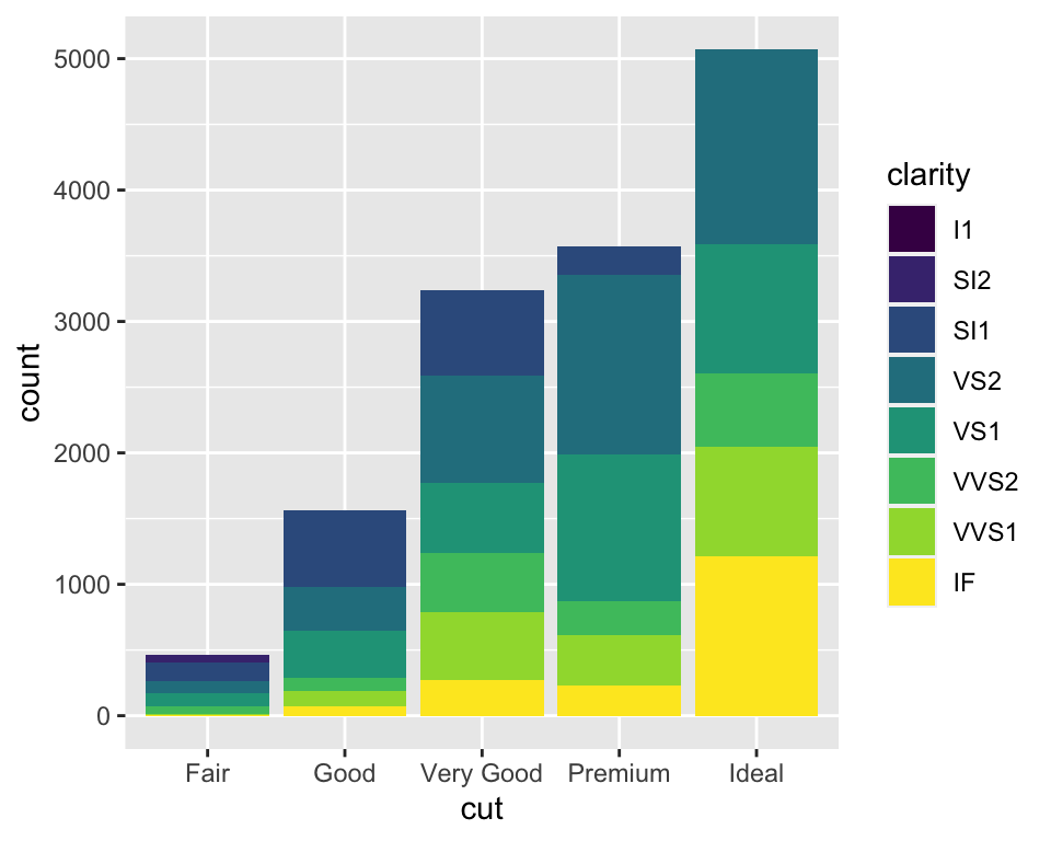
Here, each object falls exactly where it should be in the context of the plot and seems to be overlapped. It can be a little better if you use fill = NA or use alpha value
ggplot(data=diamonds) +
  geom_bar(mapping = aes(x=cut, fill=clarity), position = "identity", alpha = 0.2)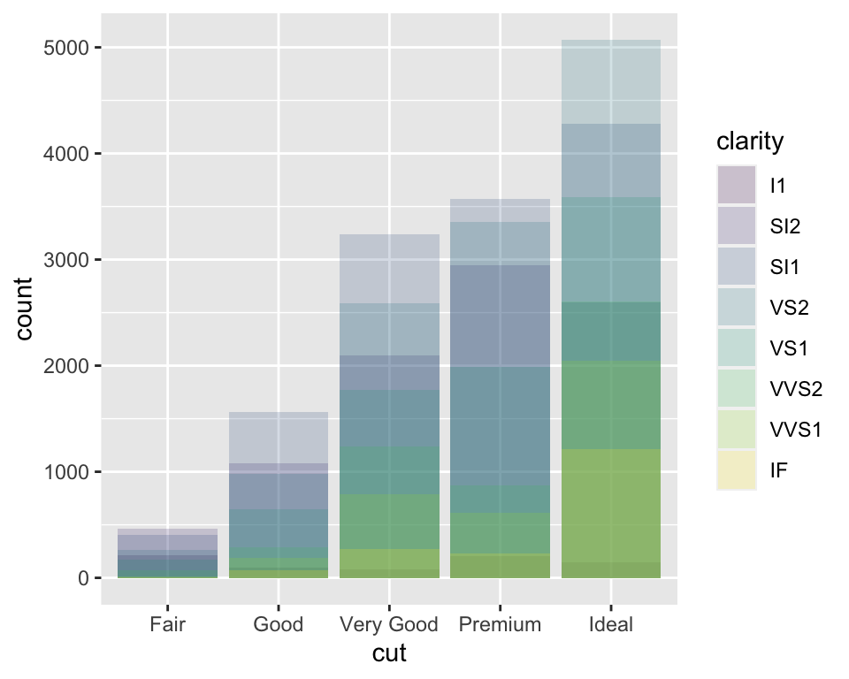
ggplot(data=diamonds) +
  geom_bar(mapping = aes(x=cut, colour=clarity), position = "identity", fill=NA) # mind the change of colour and fill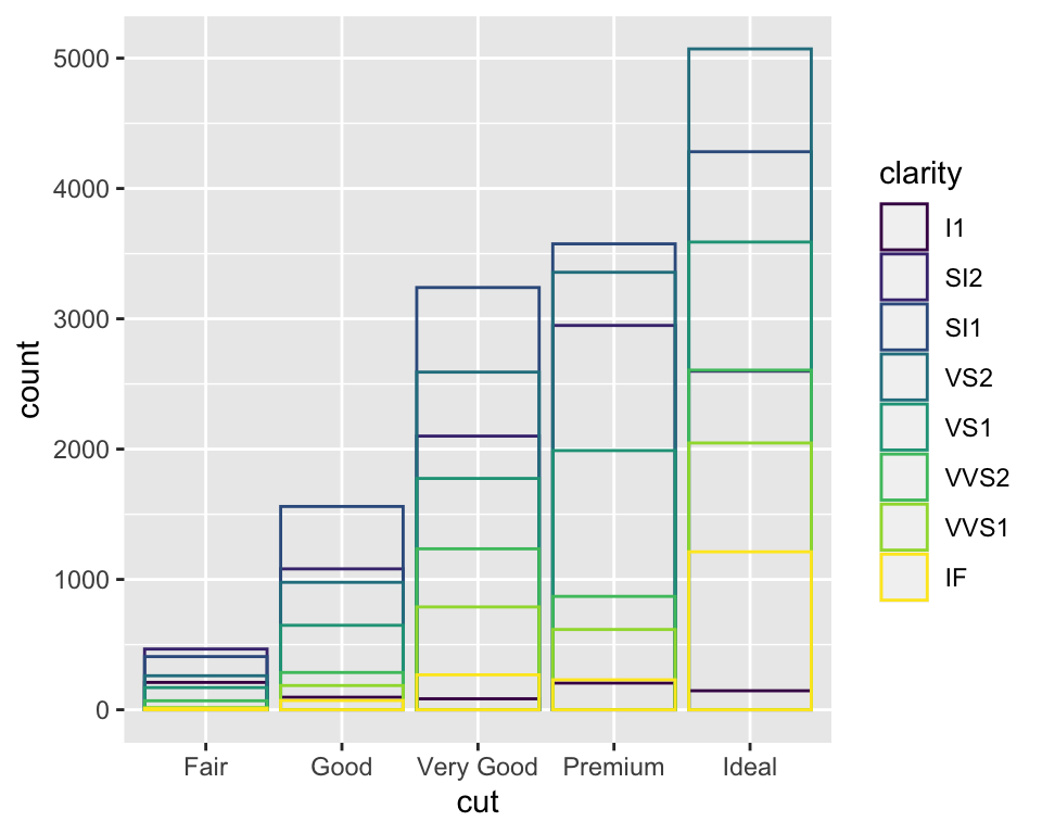
Position fill catches up all the space vertically for each bar and displays as fraction of the values
ggplot(data=diamonds) +
  geom_bar(mapping = aes(x=cut, fill=clarity), position = "fill")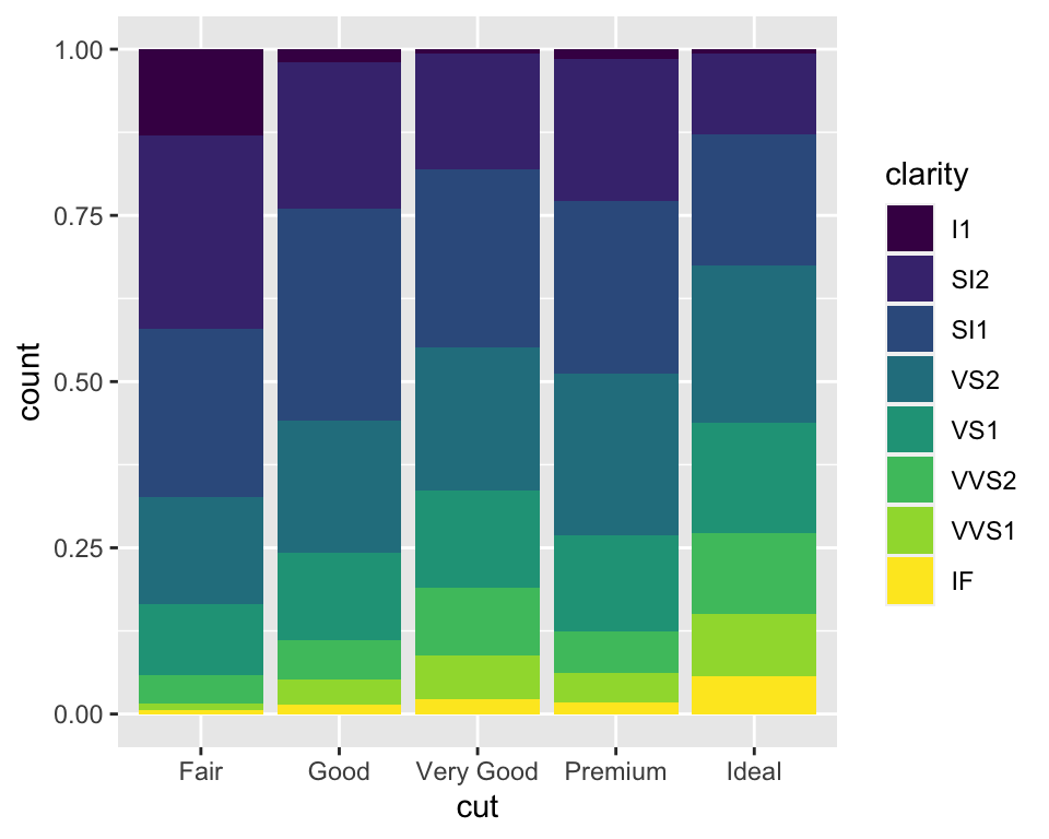
But what we usually mean by the bar plots is the next -
ggplot(data=diamonds) +
  geom_bar(mapping = aes(x=cut, fill=clarity), position = "dodge")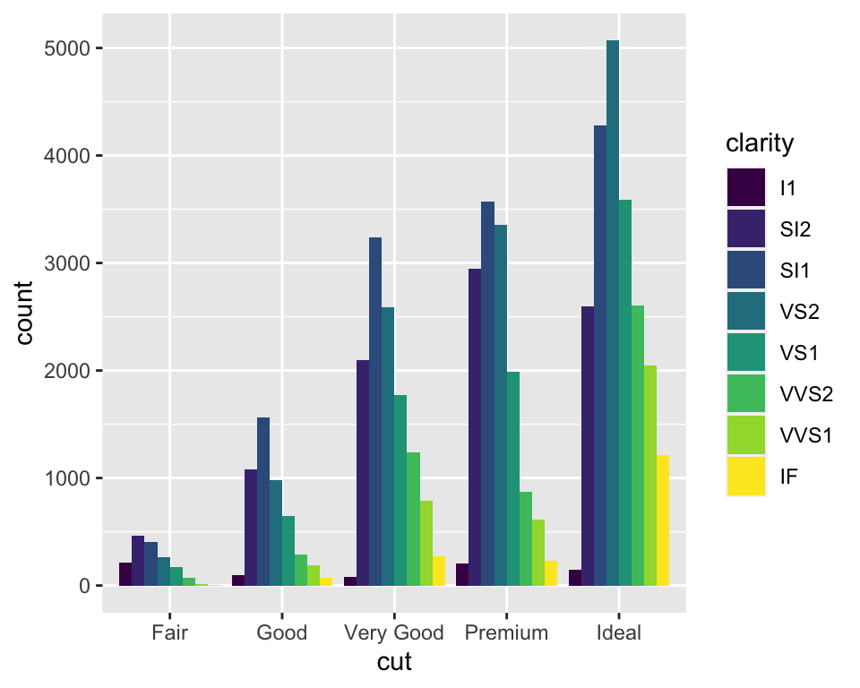
3.3.2.6.2 Boxplot
Box plot is very convenient to see the distribution of your data and compare side by side the distributions of different variables in your data -
ggplot(mpg, aes(class, hwy)) +
  geom_boxplot() +
  coord_flip()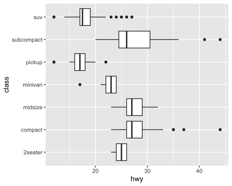
ggplot(mpg, aes(class, hwy)) +
  geom_boxplot() +
  coord_polar()
# Please don't plot boxplot in this way in real-life.3.4 Plotting exercise
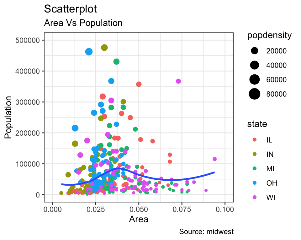
Let’s re-construct this plot. There is an interesting reason behind my backward approach. Mentioning the dataset and variables, I asked ChatGPT to write a code snippet, and it did something close to what I wanted. Now, I want you to start from the beginning. Here are some info that you will need -
You will need the
midwestdataset that comes with theggplot2package.Using
geom_point()verb, draw scatter plot using the variablesareaandpoptotal.Colour the points by
state, and set the size of them by variablepopdensity.Use
geom_smooth()verb to visualise the relationship between variablesareaandpoptotalusing loess method. Get rid of the confidence interval around the smooth line.Adjust the x- and y-axis accordingly.
Annotate the plot accordingly.
